In
the words of Bill Hicks, "Looks like we got ourselves a
reader."
Google Reader is my topic today and I will begin with a look at its place in the Google family of apps.
Google's alacrity to fill the role of feed-reader leads it in many new directions: personalized homepage, web clips (via Gmail), and the Reader. The disparity of these services speaks to the haste with which GOOG moves to capitalize on the budding popularity of
XML syndication. The
feeding ground is an elementally new market for the search company and these fragmented services evidence the growing pains. Allow me to defend the term "elementally new market": Google built its core competencies on a "come, see, conquer" mentality. Consider their bread-and-butter services: Search & Ads:
Search was a mature field before Google descended. Larry and Sergey saw the inadequacies of the technology, built a better mousetrap, and the rest is history. Ads: Again, Internet advertising had an economy all its own until Google saw fit to vanquish the DoubleClicks and elevate the medium. Gmail - another major success - challenged the fusty web mail model that reigned for a decade and Google Maps - their latest all-star offering - put Grandpa MapQuest to shame. These services - search, ads, mail, and maps; Google's best - all made revolutionary strides in established fields. They are "Google's take on ______." Their success certainly owes to the popularity of these markets, but also to Google's knack for spotting that which is wrong with a technology and then making it right.
But feeds are new. "Google's take on feeds" is a misnomer: we've
only just agreed to call them "feeds!" Google is inventing the first generation of web-based feed readers along with the other Internet Big Boys and the soon-to-be-Yahoo-acquirees like Protopage. This is what I mean when I say an "elementally different market." Google's viewpoint toward feeds is not one of hindsight as it was for search, ads, mail and maps. So while we may not forgive, we do understand the shlumpy beginnings of G's syndication support.
Theory schmeory; let's get reviewin'! Succinctly, the product is very easy to begin using and rather difficult to continue using. Easy to start using because there is a list on the left and the highlighted item is shown on the right. Difficult to manage because of the tab-like-in-behavior-but-not-in-appearance links at the top, cramped subscription management interface, inconsistent methods of adding feeds, incomplete implementation of "labels" (there is no way to search for posts by label), and as yet imperfect use of AJAX for the dynamic interface (pixels here and there don't line up, scrolling can be jumpy at times), among other things. I criticize the finer points of the interface with reluctance because I know that Google will fix these quips as quickly as I can blog about them, so I'll speak instead about the bigger picture and the fundamental ways that this could be a better product.
I lamented the impossibility of the tagline, "A Google approach to feeds." While the marketing department can't do a thing with that, the engineering team should have a motto there. Google built a name on "organizing the world's information." The "Google approach" to feeds would have this data parsed, organized and presented to the user based on interest and relevance. Instead, the Reader is a dumb server of everything it is told to collect.
Google is to be lauded for their simple UIs, but the Reader suffers from oversimplification. Feeds differ from email in that we are not obligated to consume every item. Reader is insensitive to this fact: its monolithic list, as any poly-feed subscriber can attest, lacks the dexterity needed to reach the information you really want. Example: Boing-Boing alone generates more content than I care to read most days, but to make sure that I don't miss a post from one of my many less-frequently-updated feeds, I have to dismiss each Boing-Boing post one at a time to reach the other content - tedious - or open the "Your subscriptions" box and examine each feed of interest manually - tedious and no longer simple. My list runneth over.
A possible solution is to give each feed its own list of read and unread items as many desktop aggregators do, but we then err on the other side of simple. There must be a way to increase functionality without increasing complexity.
The answer is obvious: Search! And just our luck, that's Google's middle name. It goes without saying that searching for read items is a must (and a bewildering omission from the current product, BTW), but Search affords us one better: searching for items
before we read them. Reader could separate the content stream into multiple lists based, not on source feeds, but on search terms. This would provide the ability to create topical "metafeeds" by pulling posts from multiple sources into a single list.
Suppose I created a new - we'll call them "lists" - a new list and specify a keyword: "photos." Thanks to the ole Google magic, the Reader would scan all incoming items for that word and its synonyms (photographs, pictures, flickr, image, snapshots, etc.) and would construct a digest of photo-related posts. You wouldn't be limited to one keyword, of course, and all of the
advanced features of Google Search are fair game, as well as some new ones (date posted, author, type (text, mp3, mp4, etc., assuming Google handles enclosures eventually - podcasts et al), etc.).
Lists would manifest as tabs along the top and you could create, remove and rearrange them to your AJAX-loving heart's delight. There could also be a perminant "Unread" tab so that Reader would never be guilty of depriving us an important post that didn't fall into one of our smart-lists. Leveraging the Google News algorithms, Reader could also identify items from multiple feeds that report on the same story and cluster them together with the most relevant post on top and a link to expand the duplicate items.
The main UI would remain unchanged: list on the left, highlighted item on the right. A retooled subscription management interface might be more ambitious with screen space and the "label" data could be put to better use too (think del.icio.us/Flickr and tags).
I imagine my Reader setup would resemble something like this:
"Tech" has tech news pulled from all of my feeds.
"Art" aggregates aesthetic awesomeness.
"Photos" features Flickr streams, web comics, and misc other picture posts.
"Personal" handles my friends' blogs and the like.
"Google" keeps me up-to-date on the company's many official blogs.
"Microsoft" does the same.
My last bit of advice: ditch the name. Besides
blasé, it calls to mind the Print/Book Search program which needs no further branding complications, and sounds to me like the bastard child of the defunct "Google Viewer." There's also a perfect
portmanteau that won't stay un-copyrighted forever:
Feader
"The Feed Reader"
 Notice that big mass of white on the right? It may be there for a reason - I'll get to that in a moment - but for the time being, it is fat to burn. Here's an economic alternative:
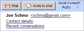 (Obviously, a slightly modified layout is needed to elegantly handle long user names:
 )
) But the issues posed by the aforementioned long user names would break this simple layout. I imagine these profile boxes will eventually contain pictures, but we must wait and see how things pan out. In the mean time, these could really be slimmed down. More quips to come, I'm certain.
